Your home is your sanctuary, a reflection of your personal style and a space where you should feel completely comfortable. A significant element in achieving that comforting and stylish atmosphere lies in the power of color. Choosing the right color scheme can transform a house into a home, enhancing mood, creating focal points, and even influencing the perceived size of a room. The seemingly simple act of selecting paint colors can be surprisingly complex, often leading to indecision and frustration. But fear not, aspiring interior designers! Mastering the art of home color schemes is achievable with the right knowledge and approach.
This guide offers a practical, step-by-step process to navigate the world of color palettes and confidently choose the perfect shades for every room in your house, ensuring a cohesive and visually stunning result. From understanding color theory basics to selecting the right finishes and considering the impact of natural light, we’ll equip you with the tools and techniques you need to create a home you truly love. Let's dive into the process and unlock your home's full color potential.
Preparation and Safety Guidelines
- Physical paint samples
- Fabric swatches
- Color finding website (e.g., Coolers)
- iPad (optional, for sketching)
- Paperlike screen protector (optional)
- Test paint colors on your walls before committing. Lighting conditions significantly affect how colors appear, so sample swatches in different areas and at various times of day.
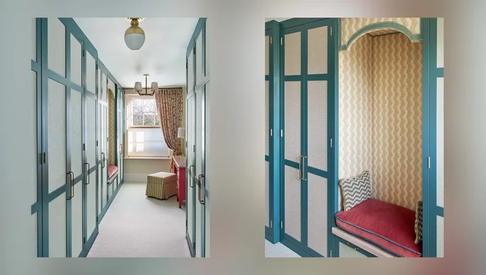
- Consider the size and orientation of your rooms. Darker colors can make small rooms feel smaller, while lighter colors can brighten and enlarge them. South-facing rooms receive more sunlight, impacting color perception.
- Don't be afraid to mix and match! While sticking to a cohesive palette is important, incorporating subtle variations and accents can add visual interest and depth to your home's design.
Step-by-Step Instructions
Define the Room's Atmosphere
- Determine the desired mood or emotion for each room.
Assess Existing Finishes
- Identify the undertones and mastones of existing finishes (e.g., countertops, tiles, carpet).

Assess Existing Finishes Find Color Inspiration
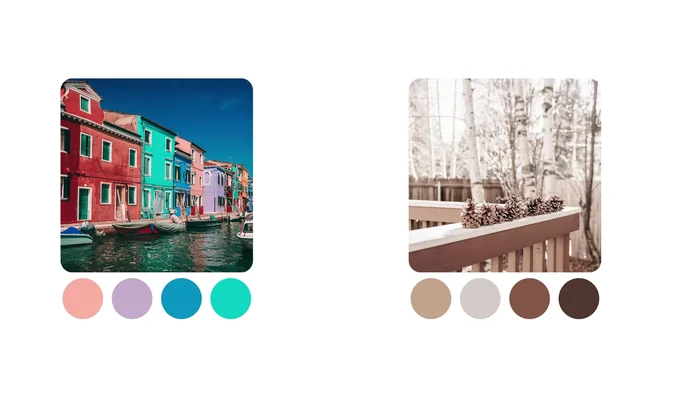
- Gather color inspiration from various sources (artwork, nature, clothing, etc.).
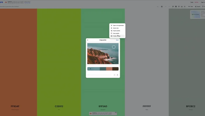
- Use a color finding website to extract a palette from your inspiration source.
Find Color Inspiration Develop the Color Palette
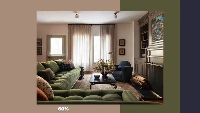
- Apply the 60-30-10 rule (60% dominant color, 30% secondary color, 10% accent color).
- Repeat each color multiple times with variations (e.g., different shades of blue).
Develop the Color Palette Balance Color Types
- Maintain a balance between muted/earthy and clear/bright colors; avoid clashing.
- Incorporate warm and cool tones, aiming for an 80/20 ratio or using neutrals as a bridge.
Balance Color Types Test and Refine
- Test paint and material samples in the actual room under various lighting conditions.

Read more: DIY Farmhouse X-Style Coffee Table: Easy Step-by-Step Guide
Tips
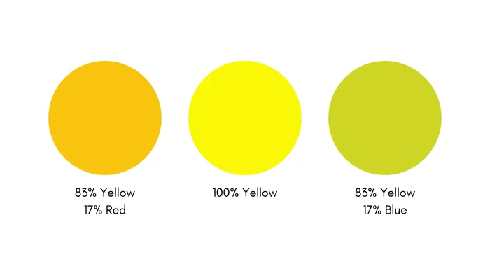
- Consider color psychology; colors evoke specific feelings.
- Weaker contrast and saturation create calmness, while stronger contrast conveys activeness.
- Color perception changes depending on surrounding colors and lighting.
- Maintain similar value relationships between colors for a cohesive look.
- If mixing muted and bright colors, make one dominant and use the other sparingly.